30.9.11

GroupHolla Facebook App

I've been working on designing an app for Facebook which enables users to set reminders for special events and allow them to record a 15 second video then invite their friends to do the same; the app will then stitch all the videos together and send it on the desired date to the person who has an event coming up.

I set out to create a logo that would convey that there are many people coming together and connecting with each other to send the same message to one special person. I chose to use semi transparent colouring to show how the layers could connect and give it a playful feel.
I decided to go with this one here I felt it captured the message I wanted to convey the most. And after going through many fonts this one here spoke to me the most.


A preview of the interface, since the app would be very content heavy with many pictures and video I decided to use black, grays and white so it wouldn't clash. 

29.9.11

D V I S I O N


Check it out: http://d--vision.tumblr.com
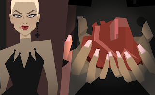
I'm really excited to share this news, my very good friend and amazing artist Augusto Quijano and I started this cool project. We came up with the idea to tell a story through images and images only. A visual conversation.
Each week one of us posts an illustration and so the other one has to come up with the next illustration a week later (and repeat the cycle). The interesting part is that the only information we have about the story is what the illustrations tells us.
Augusto and I don't speak about it, nor have a guideline, nor have discussed any of it, so the story takes shape from the individuals perception.
The idea is that each member of the audience will have their own way to see the story and make it their own.

28.9.11

BlushBox Cosmetics


The experience I wanted to create with this cosmetics site to was for the user to stay on one page with columns that would show up next to the previous column beside it once an item was selected.  


This shows the active view and what the columns would look next to each other.

27.9.11

TowerUp Facebook App


TowerUp is a facebook game which allows the user to set up a hotel, check sprites into it, collect money and in doing so they can build up their towers up high adding many new shops and floors. My first task was to create characters for with the same body types but different sets of interchangeable clothing, hair etc. to be animated in flash doing many different actions. Secondly I had to build and interface to go along with the style of the characters which made the user experience fun and easy.

Some of the many variations of characters here.


Splash screen for the game.

Close up interface for selecting a guest to stay in the tower.


A work in progress show of the look of the overall game with the interface elements showing on screen.

26.9.11

Childrens Drawing App for iPad & iPhone


I had to create an app that allowed kids to select different types of mediums such as pencils and markers with the option of tacking on stamps, stickers and having a good selection of colours to choose from. I wanted the main menu to be playful and not rigid so the first thing the child will see is the play button.


Popup screen for credits and settings.


Interface elements and boxes mockup.


Book selection screen.

25.9.11

Underwater game for iPhone

Which never made it to the app store. Long story is long :)